


Table of contents
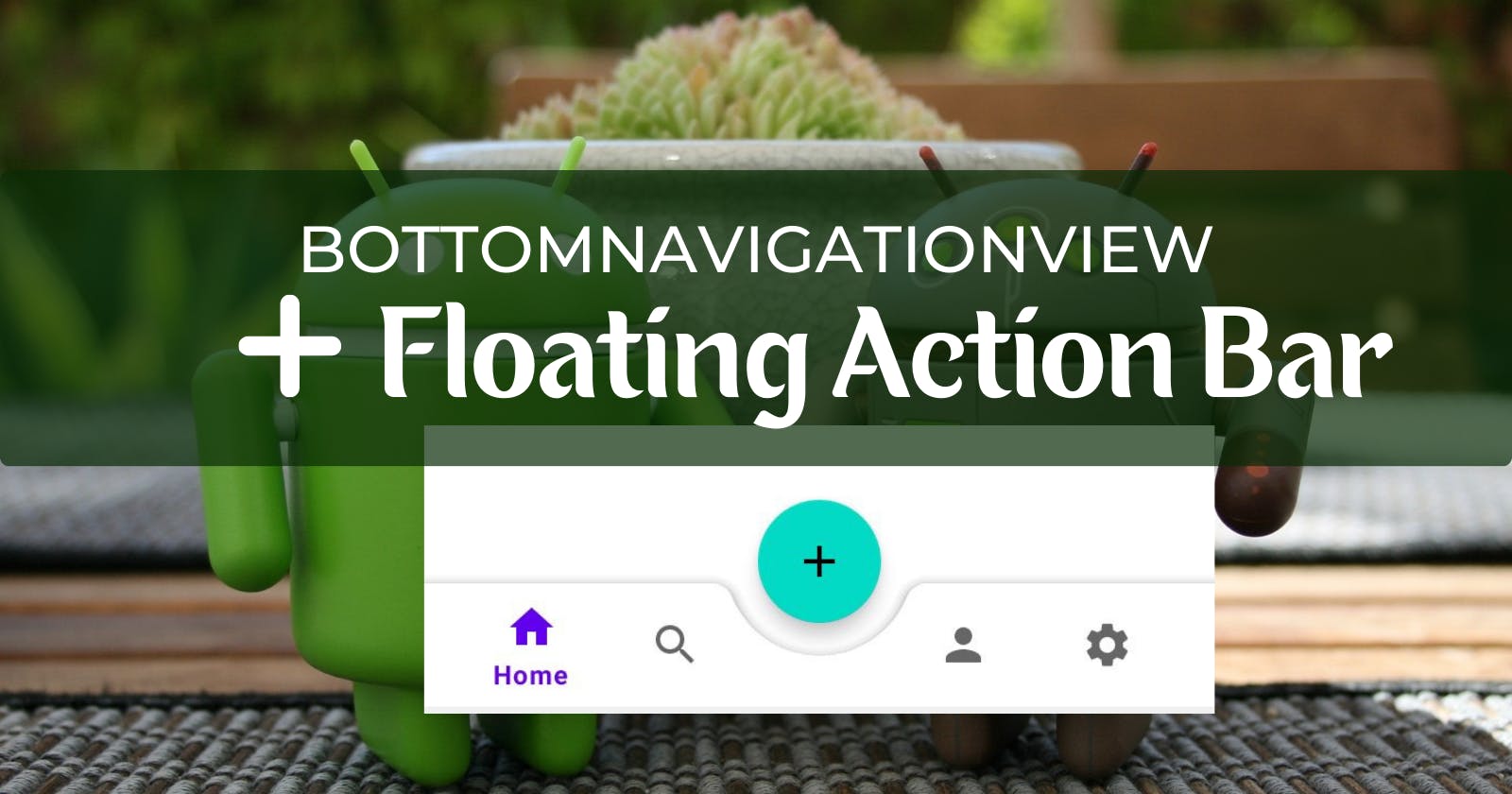
Most applications feature a floating action bar docked in the middle of the bottom bar. Do you want to learn how to implement this feature in your mobile applications?
In this article, you'll learn how to set up a BottomNavigationView with a Floating Action Bar. Let's get started!
Setting up the BottomNavigationView and FAB
Step 1: Create a new project and add dependencies on Gradle
Open your Android Studio and select New, New Project, and then Empty Activity. Click Next and set the name of your project, location, and select your language option as Kotlin.
Since this is a fairly simple project, you can leave the Minimum SDK and Package name setting as is and then click Finish.
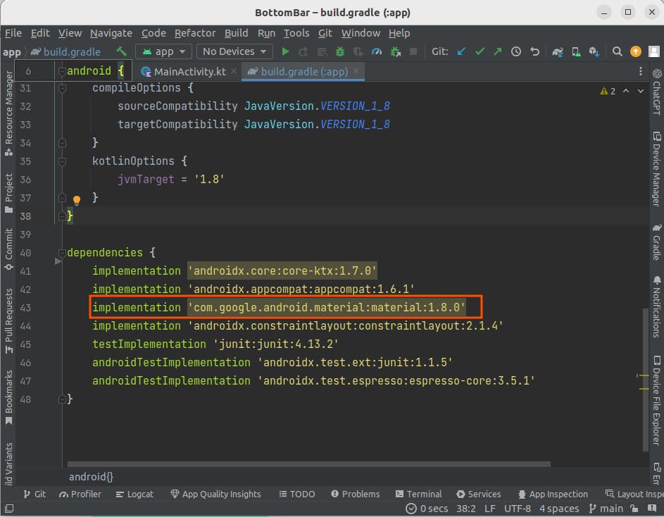
Once your project is fully set up, you'll need to set the Material Design dependency on Gradle, as you'll be using its components to build the BottomNavigationView and the FloatingActionBar.
Open the module-level gradle file and add the Material Design dependency source code if it's not already there.
Step 2: Import vector assets for Bottom Navigation
Next, you'll proceed to import icons in the form of vector assets that'll be showcased in the bottom navigation. You will need to import the home, search, person, and settings icons.
Right-click on the drawable folder and select New then Vector Asset. In the Configure Vector Asset window, click on the Clip art to select the icons needed, then rename them to suit their functionality.
Click next to Confirm Icon Path, then click Finish. By the end of this step, you should have four icons under the drawable folder.
Step 3: Create the menu resource
In this step, you'll create a menu resource file and add menu items for each of the vector drawables created above. Right-click on the res folder and select New then Android Resource Directory.
In the New Resource Directory window, set both the Directory name and the Resource type to menu, then click Ok. A new folder, menu will be created under res.
Next, right-click on the menu folder and select New, Menu Resource File. In the New Resource File window, set the file name to bottom_menu. You don't need to append the .xml to the file name as it is added automatically.
You can then proceed to edit the bottom_menu.xml file. Copy and paste this snippet of code to add menu items:
<?xml version="1.0" encoding="utf-8"?>
<menu xmlns:android="http://schemas.android.com/apk/res/android">

    <item android:id="@+id/imHome"
        android:title="@string/home"
        android:icon="@drawable/baseline_home"/>

    <item android:id="@+id/imSearch"
        android:title="@string/search"
        android:icon="@drawable/baseline_search"/>

    <item android:id="@+id/imProfile"
        android:title="@string/profile"
        android:icon="@drawable/baseline_person"/>

    <item android:id="@+id/imSettings"
        android:title="@string/settings"
        android:icon="@drawable/baseline_settings"/>
</menu>
In the above code, you'll be adding an id, title, and icon for each menu item. Make sure that you have extracted the string resources. Your strings.xml file should contain:
<resources>
    <string name="app_name">BottomBar</string>
    <string name="settings">Settings</string>
    <string name="profile">Profile</string>
    <string name="search">Search</string>
    <string name="home">Home</string>
</resources>
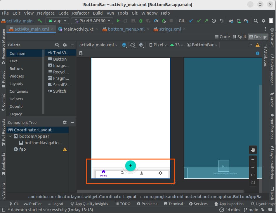
Step 4: Add BottomNavigationView and FAB in the layout file
Next, you'll need to set up the activity_main.xml layout file. You will replace the default ConstraintLayout with a CoordinatorLayout as it'll help you easily align the Floating Action Bar relative to the Bottom bar.
Add the CoordinatorLayout and a BottomAppBar with the following attributes:
<?xml version="1.0" encoding="utf-8"?>
<androidx.coordinatorlayout.widget.CoordinatorLayout xmlns:android="http://schemas.android.com/apk/res/android"
    xmlns:app="http://schemas.android.com/apk/res-auto"
    xmlns:tools="http://schemas.android.com/tools"
    android:layout_width="match_parent"
    android:layout_height="match_parent"
    tools:context=".MainActivity">

    <com.google.android.material.bottomappbar.BottomAppBar
        android:id="@+id/bottomAppBar"
        android:layout_width="match_parent"
        android:layout_height="wrap_content"
        app:fabCradleRoundedCornerRadius="10dp"
        app:fabCradleMargin="15dp"
        app:fabCradleVerticalOffset="10dp"
        android:layout_gravity="bottom">
    </com.google.android.material.bottomappbar.BottomAppBar>
</androidx.coordinatorlayout.widget.CoordinatorLayout>
Then add the FloatingActionButton view right below the BottomAppBar:
<com.google.android.material.floatingactionbutton.FloatingActionButton
        android:id="@+id/fab"
        android:layout_width="wrap_content"
        android:layout_height="wrap_content"
        android:src="@drawable/baseline_add"
        android:contentDescription="@string/floatingactionbutton"
        app:layout_anchor="@id/bottomAppBar"/>
Next, add the BottomNavigationView as a child view to the BottomAppBar:
    <com.google.android.material.bottomnavigation.BottomNavigationView
            android:id="@+id/bottomNavigationView"
            android:layout_width="match_parent"
            android:layout_height="wrap_content"
            app:menu="@menu/bottom_menu"/>
Now to explain some of the attributes:
The BottomAppBar is simply an extension of the Toolbar. It forms a shaped background on which the Floating Action Button will be anchored on.
To anchor the FAB onto the BottomAppBar, use the layout_anchor attribute in the FloatingActionButton view and set it equal to the id of the BottomAppBar .
Since Material Design is enabled in your project, the fabCradleRoundedCornerRadius attribute is used to set the corner radius of the FAB to be more curved.
The fabCradleMargin sets the margin between the FAB and the bottom bar, while the, fabCradleVerticalOffset just like its name suggests, vertically offsets the FAB from the bottom bar.
There are several Cradle attributes that affect the positioning of the FAB in relation to the bottom bar. You can play around with these attributes to see the resultant effects on the design tab of your layout file.
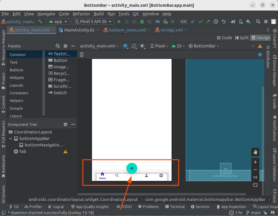
As you can see below, your project is already taking shape.
However, there are some aspects that aren't polished yet. Like the shadow effect, the white background on BottomNavigationView and the margin spacing before the Home icon.
First, you will fix the margin spacing and then proceed to toggle background and shadow effects in the MainActivity.kt file. In the BottomNavigationView add the following attribute to add margin spacing to the end of the View:
android:layout_marginEnd="16dp"
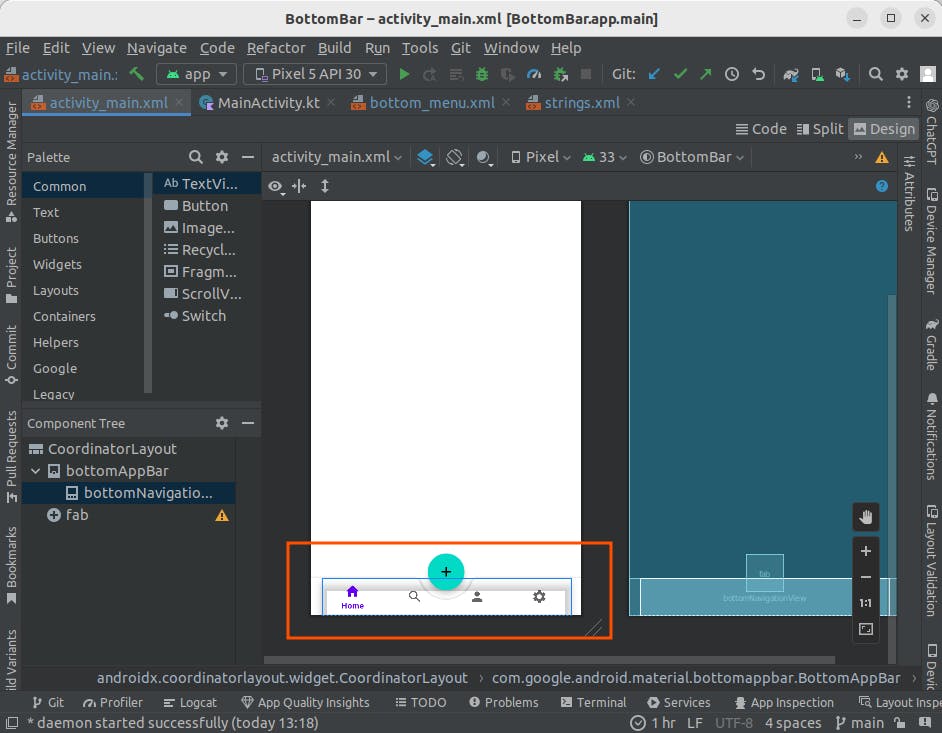
Then in the bottom_menu.xml file add a placeholder item right between the other menu items; that is, between the imSearch and imProfile menu items.
The purpose of this placeholder is to add spacing between the icons where the FAB will be located. Such that the icons to the left of the FAB and those to the right appear as if equally apart.
You can see the results below:
Also, to remove the white background add this attribute in the BottomNavigationView:
android:background="@android:color/transparent"
Step 5: Toggling effects on MainActivity.kt
You now need to remove the shadow effect and also make the placeholder menu item you added earlier unclickable so that it remains invincible, for lack of better words. To do this, first enable view binding in your module-level gradle file with:
buildFeatures {
    viewBinding true
}
Then in MainActivity.kt, add the following code. I have commented the functionality of each line of code to explain further:
package com.example.bottombar

import androidx.appcompat.app.AppCompatActivity
import android.os.Bundle
import com.example.bottombar.databinding.ActivityMainBinding

class MainActivity : AppCompatActivity() {
    override fun onCreate(savedInstanceState: Bundle?) {
        super.onCreate(savedInstanceState)

        val binding = ActivityMainBinding.inflate(layoutInflater)
        setContentView(binding.root)

        //removing the shadow effect on the BottomNavigationView
        binding.bottomNavigationView.background = null

        //making the placeholder menu item unclickable
        binding.bottomNavigationView.menu.getItem(2).isEnabled = false
    }
}
Note:
The changes in the background color and the removal of shadow effect will only be seen once you run your app in the emulator or physical device.
Hence, you shouldn't be concerned when the design view of the activity_main.xml appears unchanged.
Now run your app to see the final result!
References
Android Studio Electric Eel Essentials - Kotlin Edition
Conclusion
In this article, you have learned:
How to set up a BottomNavigationView
How to set up a Floating Action Button
And how to append the two together
I hope you now have a clear understanding of how to set up a simple BottomNavigationView with a Floating Action Button. Feel free to view the project repo on my GitHub. Follow me on Twitter and Dev.to for more tutorials and guides.
Keep building! 🌟